My plan:
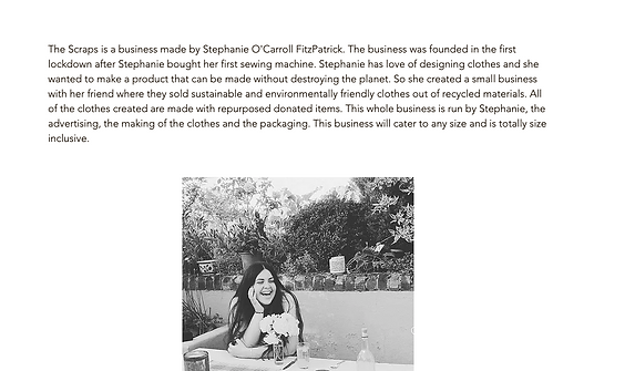
My plan is to make a website for my sisters business she made with a friend whilst in lockdown. I will be doing this as making a website will let me use my skills and I can learn new skills on the way. I will also try and make a website as the business only has an Instagram page and a Depop page. I already have the basic idea of what the website will look like where to put everything you need for the consumer/audience to be able to use the site smoothly. I will need a contact page, I will need a home page and I also need a gallery page. I need all these pages to be equally as important as each other. The home page needs to tell the audience what the website is about, The logo will be the logo they have on their business card and the page needs to have social media sticker. This sticker will take you to their Instagram page. The gallery page will have the different clothing items shown. When you click on the item you like the look of it will take you to either a new page talking about the product, or it will take you down the page to the description of the product. The contact page will have the business email displayed so you can send them an email of what product you will like to buy. This a basic plan so I may change my plans in the future.
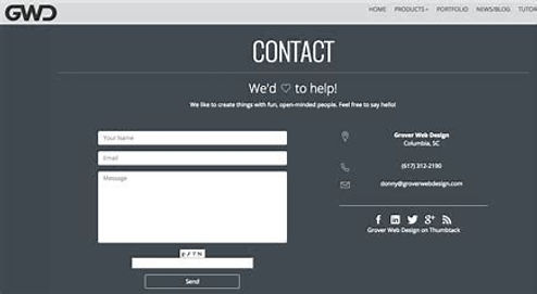
As I have never made a contact page I have done more research on examples to help me with my final project. I have found other examples and I have watched a few videos talking about the subject. However, as my sisters business is only a small just made business where they use social media as a the main platform, all the page will need is a social media button to get on to their Instagram, their email to get in touch and a phone number to call. Although as my sister and her friend are studying at university they may not want the phone number included on the website.


This is the time and deadlines I have to meet the brief and get a working project done. I feel that with the project I have chosen, I will be able to meet the deadlines.


The Home page will have the business logo at the top. The first thing that will hit you is a showreel of their designs. I will need to add two social media stickers. This will either send you to their Instagram page or it will send you to their Depop page. This is so you can instantly go to their other social media platforms. There will be a descriptive paragraph under this explaining how the business came to be, why it was made, the people involved and how to get in touch. Under the paragraph there will be two more photos either side of a video where one or two of the friends involved will explain the business, what the business is for and what they want the business to be.
For the website it will need to have a page where you can look at the different designs. These two pages have my plan of what I want it to look like. The first page has a gallery with all the different designs shown. When you find the design you want to buy or learn about, you press the image. Once pressed, the image will be linked to a page with all the information about the product. It will tell you about what the design is, what the product is made out of and most importantly it will tell you the price. The price will be talked about in the first sentence. On the Information page you will be given a link to the contact page at the bottom as well as being on the menu bar.


On the contact page I will need to add a contact form that will send contact to the email of the business. The reason why I will do this is because both of the partners are at university. As a result of this a contact form will work the best for them as they can not have constant phone calls while studying. The form will also be easy for the consumer to write down their body size and what piece of clothing they will like to buy. With this information both my sister and her friend can easily start making the product when they can. I will add a paragraph explaining to the consumer what to do to get in contact and how to make an order. I will also add the media stickers again so the audience do not have to go back to the home page. On this page I will use their orange logo if it does not clash with the rest of the websites colour scheme.
My target audience would be young woman aged 16 to 27. They would want to wear cloths which are environmentally friendly and made with recycled sustainable materials. The colours they will like will be white, green, orange and pink. The target audience will mainly be English who are living England. Most likely most of the audience will be living on their own or they are at university.
The first part of the project I will do is make a home page of the website with the knowledge of what my sister would like the website to be. I will then send the finished project to my sister and get some feedback. I will then use the feedback to improve and make the rest of the website. This should help me get the exact website my sister wants.


The first thing I did was select a type of template on wix. I chose business as with the knowledge of what my sister wants it seems like the best fit. I then chose a template I feel I can work with and went from there. After a few tries and errors I got to the first basic picture part. which was to get rid of the stock images and add the website logo.


This photo shows that before writing anything on the home page I first spoke with my sister asking her to give me points to write about in the first paragraph that will explain the business and how it is made. This paragraph will be the first thing you see on the website after the logo.
While making the home page I looked at the rest of the website template. This gave me new ideas about the website. Rather than having a page explaining every product I will show the product with the price underneath this is so you don't have to read boring information to find out the price. I may have a gallery page with people wearing the products and the shop page will just be pictures of the products.


The first part of the page was to add a descriptive paragraph of what the business was about and how it was made. This is for the consumer to know what the page is for. The second part was to add a video of some products that are made. This is for the consumer to get a feel of what the products are like and the style of the products. It is also nice to see a video on the first page. The last thing I did was added six photos so the consumer can see the products being worn.

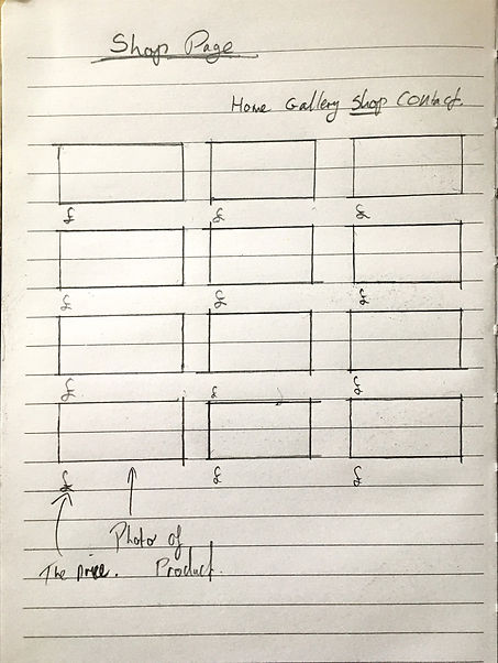
For the website I have decided to scrap the idea of having a gallery of all the products to read about them. Instead I have decided to have a shop page and a gallery page. The gallery page will show off the products being worn by the models. The shop page will have products shown with the price at the bottom. When you press the the product you like the look of it will take you to a page with a closer look of the product and a little description of the product on the side. The next page I will make is the gallery page. This page will be the second page on the website.


Before I started making the gallery page I changed the colour of the menu bar from black to light blue and then I made the strip on the page to pink. While making the gallery I downloaded all the photos sent to me by my sister to the website. I then added them to the gallery. All I needed to complete the gallery was a showreel. For this I asked my sister for videos of her friends in the clothes. When I get all the videos I will then edit the videos together to make one big showreel.

On the contact page I linked my sisters Instagram and De pop to the website. Now if you click the social media sicker you end up on her Instagram or De pop page.

I added the email my sister uses for her business so the consumers can email my sister whenever they want about inquires.

On the website a changed the page transition from none to Horizontal. This is so the website is not too boring.


I added my sisters business pay-pal account to the website. This means you can buy a product through the app.

On the website I had a contact form. To make this work i needed to link it to my Sisters business email. The first part was to try my email first to check if the form worked. Once I knew the form worked I needed link it to my sisters email.


Before I succeeded I ended up failing as I added my sisters email in the other emails section. To correct this I deleted her email from this section then added her email by managing team. This means both me and my sister will get the emails from the contact form.

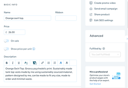

These photo's show that I added the products to the website. However, this part is far from finished. This is because for now I am using them as placeholders so I know what would be there. The first part of this page was to add the pictures of the products that you can buy from my sister to the product page. Secondly I added a paragraph for each of the products. Lastly I added the price. In time I will finish the product pages by adding a description of what the products are made of, I will add shipping and buying info and I might change the font colour.

Before I went further I thought it was a good idea check and see if the cart/check out worked. As you can see once the product you want is added to basket the basket logo shows you have 1 Item saved/picked to buy. The total is shown and the PayPal checkout is a button to press to make your order made.
The Showreel
Through research on showreels I know that I need a showreel that is around 1-2 minutes long, the showreel should show some products and the videos in the showreel need to be short. To make this showreel I will use Premiere Pro.


On the showreel I used royalty free music from youtube. I downloaded the music through notube. net then I added the download to my showreel. The track I am using is Duft Pank by Bugs and Daff. Once the track was in place I cut the track to the time I wanted the showreel to end.
The song I am using.
https://youtu.be/r75cTpUS7tM


Once I added the photos and videos to my showreel I added some effects to transition from a section to another. This is to make sure the showreel is not too boring and keeps the audience watching.


On the bottom of the pages I added a back to top button for people to press to get back to the top of the page. To achieve this I added the button icon then I linked the button to the top of the page.


I made some changes to the home screen as the audience would not of known what the website was for from the home screen. To change this I changed the logo to the orange logo as it is the brand name. I got rid of the paragraph and added it to a knew page called the story. I then added two photos at the top of the page with a button named shop now. This button is linked and will take you to the shop when pressed. I did this so the audience will instantly see the style of products and decide if they like the products or not. The button is placed as the audience can go straight to the shop rather than having to go through the pages. The only problem with this change is the logo as the orange may clash with the rest of the website. For now I will just use it as a place holder and a reference incase I need to make a new logo to fit the website.
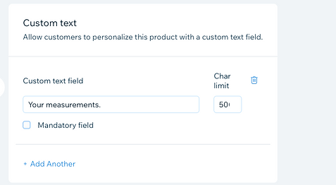

Due to the products being fit precisely to the consumers body I added a measurements box to the product pages. To do this I added a customer text field where the consumer can add personal measurements to the order.


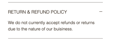

The last part of the products page was to add the information about the product. This consists of the return and refund policy, shipping info, product info and lastly buying the product.

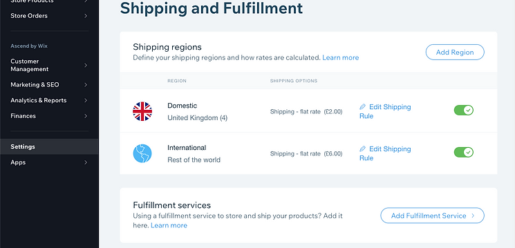

To add a shipping fee I needed to go to the website settings. Once there I went to to the shipping section and pressed either the international or domestic icons. This is where I added a shipping fee as standard shipping and I placed it as a flat Rate. For domestic shipping, E.g. England, the shipping price is two pounds. However, if you are international you would have to pay six pound for the shipping price.

The logo I was using was showing the pixels which made the website look unprofessional so I am going to make a new logo for the website. This drawing was my first idea for the logo which was a mix between the two logos that are already made.


The logo was made on Adobe photoshop. Before making the first idea properly I first made a basic version to see what the logo could tern out to look like. Once happy with the design I made the idea properly on photoshop then exported it to my computer as an image. I did make two changes from the drawing. One change was the colour of the writing the second change was where the writing would be.

The problem with my first idea was the fact that when I changed the logo to the logo I made I found out that you could not see the writing and you could still see pixels.

This is my second logo idea. As you can see it still includes the already existing logo, this is because I feel it would be beneficial to have a logo the audience has already seen from my sisters business card. The logo will have pink text as the design is pink and adding another colour to the mix would make the logo too much.
One small problem on the finished logo is the letters are too far down so they precede into the logo section which is slightly a different colour. This does not look very good so I will need to go back and edit a tiny bit more. Other than that the logo is exactly how i want it.


To sort the lettering I went back onto photoshop to change the positioning. While on photoshop I found a way to make the the background the exact colour as the already existing logo. I also found the exact colour of the design for the letters. This is good as this means there are not too many of colours in the final logo.

My sister got seen by a French TickTock and Instagram influencer called Marie Gageuch and was asked for new designs so that that Marie can chose three designs from the new selection. Due to this I had to add new designs to the shop and a sold out ribbon to the sold out old designs.

To achieve the sold out ribbon I went to the ribbon section and added the word sold out to it.