top of page
So far my sister has two social media platforms, De-pop and Instagram. I will make a websites that has its own design. I will use the logo she has on her business card so the colours may consist of the same colours on the card which are light blue and pink.I asked my sister how she sells her products. She sells her products by using De-pop and Instagram. The buyers send money straight to my sister through PayPal. If the buyer is following the Instagram account they will get 10% off. For the look she wants a simple website with photos of all the products. She wants information about the business to be present and a way to contact her. The website has to have her Instagram linked as instagram is where she posts new designs and photos to keep people interested. The colours scheme she wants is the pink and light blue like her card. The function of the website is to show of the products and to explain the business. lastly it has to direct the audience to the Instagram and De-pop page.
colour design.


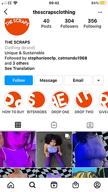
From their two logos and already existing Instagram page, I can get a good idea with what the colour scheme can be. I also have a basic Idea of what font to use. The left logo is what they use for their instagram. If I use this logo I would make the website have the colours white, orange and black. The right logo is the logo they use on their cards. If I use this logo the colours I would use would be white, pink and black. From the Instagram page they use the font lemon milk from an app called 'Over'. Personally I would use the font Avenir Light as I have easy access to the font and it is not to fancy and not to basic. In my further research I will look at different fonts to see if I can find better, more pleasing fonts.
My research consists of watching tutorials on youtube that talk about how to make a website on wix. This is so I can get different ideas and ways on how to work with wix. I already know some basic skills but after watching these videos I know by the end of this project I will learn new skills. For me I would say the the Home page will be the easiest to make. As a result of this I believe I would need to make sure I have the time to make the contact and gallery page. For the gallery page I will write what I will say for the items of clothing before actually making these pages as it will save a bit of time and I wouldn't be wasting my time trying to know what to write while making the page.


While looking for fonts i've looked for basic fonts used for business. I have found images of examples to help me decide what font to use for the website. This so I can see if there are better fonts to use from the font the business already uses and to see what will look good on a business website. At this moment I feel that the font Avenir light will be the best font for the colours used by the business. However, I also feel the font Letters will also be the best font for website. As a result of this I will try both fonts on the website, see which one I like better and then make all the writing that one font.
As I am making a website I will need to have professional looking pictures. To achieve this I will researched how to photograph products so they look professional.


https://www.oberlo.co.uk/blog/take-amazing-product-photos-with-smartphone
This website by Andrew Roach talks about how to take photos on a smart phone. This is important as more people have smartphones to hand rather than a professional camera. My sister is one of these people. I like how simple it can be to take photos professionally and it is useful to know that all you need can just be a piece of paper and a wall.

https://www.practicalecommerce.com/How-to-Take-Gorgeous-Product-Photos
This page by Jason Lawrence teaches you how to take product photos on a nice camera. From my research I can see that people highly recommend using a smartphone camera as smartphones are quickly getting better cameras every year. This is very good as my sister would most likely use her smartphone rather than her camera as she does not have her camera with her.
https://www.shopify.co.uk/blog/12206313-the-ultimate-diy-guide-to-beautiful-product-photography
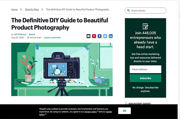
This website by Jeff Delacruz talks about the equipment you will need. The main element of a product photo is the background will be white. Paper and white bounce card made from foam and cardboard are a good solution for this. He also makes sure you know that the best room to take photos in has to have windows next to a wall. This is because of the natural light making the photo brighter.

For further research on websites I looked at Etsy as the website sells personal items/products from individuals. This is similar to the website I am making for my sister who is selling her own items she made. I love this website as it is easy to move around and use. The colour scheme is also pleasing to the eye.

While looking at Etsy's website I looked at a few product pages. This is so I can compare the placeholders I have to a finished product page. When I come round to finishing my websites product pages I can use these finished pages to help me complete and add missing parts to my pages. From this page I can see I can add how many sales of the product there have been. I would add where the seller ,my sister, is based and I could add reviews.
While looking at Etsy for the second time I can see that products have a best seller and you can see the free shipping stickers when you look at the different products.
On the gallery page of my website I will make a little showreel. Before I can make this I did some research on how to make a showreel and the basics of a showreel.

https://www.screenskills.com/starting-your-career/building-your-portfolio/how-to-make-a-showreel-for-film-or-tv/
This website by screenskills tells you that the two most important parts of a showreel is to know the audience and to keep the showreel short. When I come round to making my showreel I will do more research on the target audience.

https://thecrewingcompany.com/our-top-tips-for-creating-your-showreel/
This website by The Crewing Company has a good section about the length of a good showreel this is important to know because I do not want to bore the audience. Because of this website I have decided my length mark will be 1-2 minutes.
https://www.creativebloq.com/audiovisual/perfect-showreel-top-tips-9134570
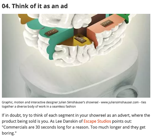
This blog by creative bloq gives you top ten tips on how to make a perfect showreel. This part talks about how you should act as if the showreel is an advert. This re-establish the point of how long the showreel needs to be and makes you understand that a showreel needs to show and sell the products being shown.

https://www.audionetwork.com/content/music-for/showreels
Once I have all the clips I need for my showreel I need to add music. This website by Audio network states that if my showreel is a rapid collage type I should have one type of music through out. However, if my showreel is a scene based showreel I should have at least a couple of different soundtracks to suit different scenes. The showreel I will be making is a rapid collage type because I feel this will be more fitting for the website. Although my mind may change once I receive all the clips I need. I also have changed my mind and I will now put the showreel on my home page rather than the gallery. I have chosen to do this as the audience will be shown the video first thing and I feel this would be a better Idea.
My target audience.
For the showreel I need to understand the target the audience that will use the website. The target audience will mostly be young woman at the ages of 17 to 21. They will be in to fashion and they will will be individuals who want to help make the world a better place by investing in recycled goods such as clothing. With this knowledge I know that the showreel needs to be short and snappy. The showreel should colourful and eye catching so the colours used should not be boring dark colours like blacks and greys.
On the website I needed to add a shipping cost so before I could do that I needed to do some research. This video by How to Digit was the video that I used to help me achieve a shipping code on the website.
bottom of page